 Originally published at Hidden Gems Books.
At the end of May Amazon’s e-publishing venture Kindle Scout was put to rest after a run of three-plus years. Amazon announced the winding down in an email sent to all of the program’s registered users (“Scouts” in Amazon’s parlance) on April 2. The email was cool and understated considering the subject matter: “[W]e wanted to let you know of some upcoming changes being made to the Kindle Scout program” followed by businesslike details of the program’s orderly shutdown. Amazon’s Kindle Scout was an innovative approach to publishing never before tried, yet it died with neither a bang nor a whimper, but with the clearing of a throat.
Reader-powered publishing
Let’s rewind and look at what made Kindle Scout so different in the publishing world. Rather than the traditional process of publishing—unknown authors cold-submitting into a mountainous slush-pile while well-known authors are courted by editors—Kindle Scout tacked a direction both democratic and meritocratic in nature, a process it dubbed “reader-powered publishing.”
It worked like this: Writers submitted their novels to Kindle Scout for consideration. Kindle Scout posted the first three chapters on their Amazon.com web site along with the book’s cover, author’s bio, and so forth. Readers perused these novels much like bookstore patrons sample paperbacks from a rotating wire rack. Readers—”Scouts”—could then vote on which novels they wanted to see published. (Scouts were rewarded for participating by receiving free ebooks of accepted work, which in turn drove reviews and ratings on Amazon.) Each books’ nomination campaign lasted thirty days, giving authors ample motivation to promote their work via the social networks, word-of-mouth, message boards—some even purchased online click-through advertising for their campaigns.
If an author earned enough attention from Scouts (and the approval of the Amazon editors) they could secure a contract with Kindle Press, the e-publishing arm of Amazon that administered Kindle Scout. The contract included publication in Kindle format (sorry, no paperback), a $1,500 advance, fifty-fifty ebook royalties, and marketing backed by Amazon’s muscle power. Not shabby for any struggling writer attempting to break into the publishing world.
Kindle Scout’s first round of winners were announced on November 27, 2014. Over the next three and half years, Kindle Scout would select for publication nearly 300 titles of all genres and styles. Books ranged from the straightforward to the bizarre, from romance to science-fiction to historical dramas to novels of literary intent. Kindle Press was not a publisher of genre fiction—it published everything.
Kindle Scout’s semi-open approach to publication was bolder than it sounds. An unspoken belief in the traditional publishing world is that book editors have reached their position because they’re fit to judge a novel on its artistic merits and profit possibilities—editors are the professionals, the gatekeepers, the tastemakers, the adults in the room. Granting Scouts that responsibility and power sounds absurd on the face of it. After all, anyone with an Amazon account could sign-up and start voting—who do you know without an Amazon account? And yet—it worked.
In addition to the manuscript itself, Kindle Scout expected writers to provide a submission package: a 45-character tag line (harder than it sounds!), a book description, a thank-you note for Scouts, and even the book’s cover. Off-loading these tasks on the author meant the writer was wearing shoes normally reserved for book agents and front-line editors. Kindle Press sometimes released the author’s submission package as-is with no editorial or artistic revisions. (Unfortunately, this led to an early reputation of publishing “trash” novels fostered in part by a snarky write-up in Slate magazine.) Later on, editorial services were offered to accepted writers. Some books received new covers after publication gratis Kindle Press.
Kindle Scout was one-part bold experiment, one-part do-it-yourself publishing, and one-part partnering with Amazon’s marketing might. Another way to put it: Kindle Scout was turn-key independent publishing for the small-time author ready to step up their game.
My experience
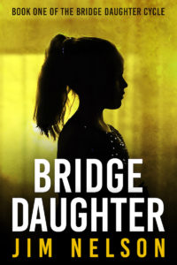
 When I submitted my novel Bridge Daughter to Kindle Scout, that’s pretty much how I viewed the program: An experiment in independent publishing with potential big returns. I’d shopped my book around to a handful of agents with the usual discouraging results and form-letter responses. Curious, I studied Kindle Scout’s FAQ and legal boilerplate and thought it was worth a go. If nothing else, I knew I’d kick myself later if I didn’t at least try.
My attraction to Kindle Scout was not merely its web-savvy nomination process. Kindle Scout’s winners list boasted publisher-friendly genres like romance and epic fantasy as well as quiet and quirky work. I found myself drawn to novels like Katie O’Rourke’s family drama Finding Charlie, Erik Therme’s chilling Resthaven, and Bradley Wind’s wonderfully personal A Whole Lot.
With my novel prepped and submission package assembled, I filled in Kindle Scout’s online form, clicked a mouse button, and sent my book into the aether. Four days later, my book was on the Kindle Scout web site and accepting votes. If you’ve submitted work to agents or literary magazines and waited months for a response, four days probably sounds like sheer fantasy. It was another example of Kindle Scout ignoring accepted norms in the publishing world.
Plenty of people (including myself) pondered the skeleton key leading to publication. Was it page views of your book’s Scout page during the nomination period? The number of reader nominations? Kindle Scout’s secret sauce was its mysterious “Hot & Trending” badge which signified growing interest in your book. Speculation surrounding the algorithm was so rampant, disreputable “services” arose on the Internet purporting to guarantee thirty days of Hot & Trending for a modest nonrefundable fee.
It may sound naive, but I suspect Kindle Press editors tended to publish based on content and marketability—in other words, using criteria much like their traditional publishing counterparts. The number of nominations a book received was never revealed to a winner so far as I know. (There’s a reason Scouts “nominated” books rather than “voted” for them. It was not a purely democratic process.) It seems to me the coveted Hot & Trending badge kept authors busy promoting their book during the 30-day campaign, doing the legwork a tech-shrewd publicist would normally perform.
And perhaps that was the best reason for an independent author to try Kindle Scout: Promotion. Putting sample chapters of your latest book on amazon.com before tens of thousands of potential readers is a fine way to generate pre-release buzz. The Kindle Scout platform was custom-built to kick-start ebook sales.
Alas, the good times hit a road bump in the first quarter of 2017. A change in editorial staff was announced via private channels to Kindle Press authors. Although not obvious at first, as the months wore on the pace of accepted manuscripts slowed to a trickle. The diversity I’d so admired also narrowed. A Kindle Press editor admitted to me earlier this year they were seeking work for the “Kindle Reader:” accessible fiction for an adult readership. Nothing wrong with that, merely unfortunate that Kindle Press couldn’t keep the door open for writers striking out on a different trail.
What’s next?
With Kindle Scout’s funky little experiment shuttered for good, I find myself strangely nostalgic. There really was something exhilarating about joining the experiment and seeing where it would take me. It strikes me that Amazon charted a map showing a new way of doing business in the publishing world. Kindle Scout’s formula could be replicated by an ambitious and web-savvy small publisher, or even an established house’s imprint seeking to shake things up. Yes, the book closes on Kindle Scout with the clearing of a throat. Let’s see if there’s a sequel.


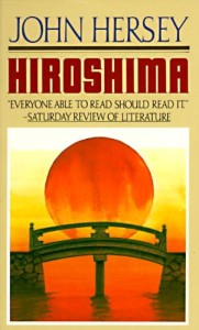
 For the sake of example, let me take a physical book off my shelf—John Hersey’s Hiroshima.
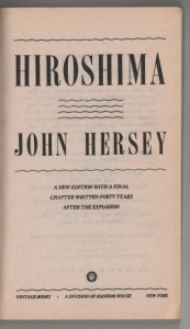
 Then comes the title page, a clean, almost retro layout befitting the book’s original publication in the 1940s. A small note indicates the final chapter was written more recently, forty years after the bombing of Hiroshima. Again, that’s a nice piece of information to have—that while I’m reading a history book originally published contemporaneously with the events it describes, it’s not been frozen in time.