
 Late last year I wrote about my love of front matter using John Hersey’s inestimable Hiroshima as an example of why the first pages of a book matter. To mark the 70th anniversary of Hiroshima‘s publication, BBC News published last week a fantastic article on the history of John Hersey’s masterpiece, detailing both the 1946 New Yorker article he penned as well as its reception when published in book form.
Not only does the BBC article reproduce some of the pages of the original “Reporter at Large” article—The New Yorker really hasn’t changed in 70 years—it includes a quick biography of Hersey and the circumstances leading to his assignment in postwar Japan. One literary tidbit worth mentioning:
[Hersey] expected to write, as others had done, a piece about the state of the shattered city, the buildings, the rebuilding, nine months on. …
On the voyage out he fell ill and was given a copy of Thornton Wilders’s The Bridge of San Luis Rey. Inspired by Wilder’s narrative of the five people who crossed the bridge as it collapsed he decided he would write about people not buildings. And it was that simple decision that marks Hiroshima out from other pieces of the time.
Wilders’ novel is an unapologetically Christian story scrabbling for meaning in the remains of a supposedly senseless tragedy. It’s an apt book to prepare one’s soul for writing about the tragedy at Hiroshima.
A war correspondent, Hersey would’ve had practical experience writing of attacks and military maneuvers as well as the journalist’s skill for getting the four W’s down on the page in economical, readable prose. Yet Hersey chose to write about civilians, each detached from the war, rather than the larger geopolitical context. This is why Hiroshima is sometimes seen as an early form of New Journalism, although unlike its later practitioners, Hersey maintains the traditional journalist’s distance from his subjects.
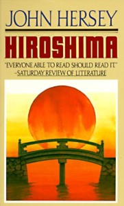
The BBC retrospective also has a nice gallery of Hiroshima‘s covers over the years, including the one I mentioned in my earlier post (and displayed above). Each complement Hersey’s writing in their own ways, although I remain partial to Wendell Minor’s cover for the reasons I explored before.
Most impressive for me is Hersey’s refusal to be interviewed by the BBC, or for most anyone. From a cabled response he sent to the BBC (probably mangled due to the quality of telegram transmission at the time):
Hersey gratefullest invitation and BBC interest and coverage Hiroshima but has throughout maintained policy let story speak for itself without additional words from himself or anybody.
Here’s to a time when authors believed their work should speak for itself, rather than the modern inclination to itch and claw for more book tours, more time in front of a microphone, and more publicity to burnish one’s credentials and sell more copies.
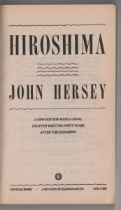 Then comes the title page, a clean, almost retro layout befitting the book’s original publication in the 1940s. A small note indicates the final chapter was written more recently, forty years after the bombing of Hiroshima. Again, that’s a nice piece of information to have—that while I’m reading a history book originally published contemporaneously with the events it describes, it’s not been frozen in time.