
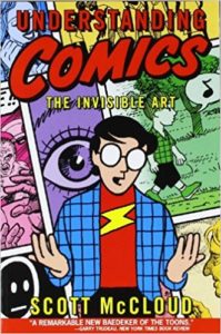
 Previously I wrote glowingly on Understanding Comics: The Invisible Art by Scott McCloud. While I gushed how thoroughly McCloud dissects the language of comics, I didn’t spend much time (if any) on how Understanding Comics has affected me as a fiction writer.
Rather than expand my review to, oh, 10,000 words or so, I’ve broken up lessons I’ve drawn from Understanding Comics into separate posts. Most of these posts will deal with narrative structure in fiction, so they might be viewed as a supplement to the series I’ve been developing on fiction treatments and outlines.
Gutters & paragraphs
I write fiction: novels, short stories, the occasional novella. My chosen art form is pure text: letters to words, words to sentences, sentences to paragraphs, paragraphs to chapters.
Scott McCloud’s chosen art form synthesizes images and written language into panels and panels into pages—comics. (Most people forget comics deal with text as well as images, another reason he calls comics “the invisible art.”) Word balloons, descriptive headers, even Batman’s BLAMMO!! coordinate with pictures in cell-like frames.
This doesn’t seem terribly applicable to writing fiction. What lessons can a fiction writer possibly glean from Understanding Comics?
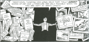
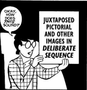
Comics are a sequential art. Their “motion” depends on the layout of images across a page and the order with which they’re consumed by the reader. This is not so different than a story or a novel, only that they are built with a single component, words. But like comics, that single component is laid out sequentially, with words grouped into sentences and paragraphs. It may seem like a stretch, but I say these groupings act as narrative “panels.”
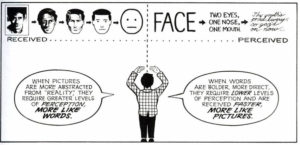
If you look back at my last post, you’ll notice McCloud identified written language as the ultimate pictograph in his “Picture Plane” diagram. By his reckoning, fiction is like a comic book with all the imagery stripped out. In comics, image and language spin together like dancers on a dance floor. In fiction, language is a solo act. Words are delegated to do all the heavy lifting.
Also like comics, fiction has a narrative “clock” which may be slowed down or sped up panel-by-panel, sentence-by-sentence:
Probably the most-quoted section from McCloud’s book is the chapter “Blood in the Gutter.” Gutters are the blank space between panels (although some people question if even a space is required). For proof of McCloud’s obsession with the language of comics, look no further than his exhaustive dissection of the role of gutters in comics—the role of blank space in telling a story.
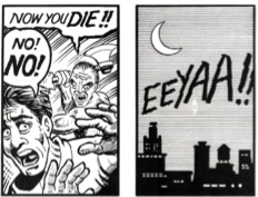
The blood in the gutter flows between seeing the axe-murderer bearing down on his victim in the left panel and “hearing” the scream across the night sky in the right panel. This closure occurs in comics as well as fiction (and in most other narrative arts too, such as film). McCloud reminds us, visually and lucidly, that narrative is a participatory act. No reader? No story, then, only ink on the page.
Closure in fiction is as complicated as it is in comics, and I can’t possibly cover all its facets here. One type of closure comics and fiction share is the use of white space (“empty space”). Take the above fiction example and add an asterisk:
Even though the only change between these two examples is the asterisk centered on the line, it “feels” like more time has passed in the second example.
Different publishers use different devices to mark section breaks, such as three asterisks across the page, a short line or curlicue, or no print signal at all other than extra blank space separating the two text blocks. Often the first paragraph of the new section is not indented or has some other print feature to distinguish it, such as using small caps for the first three words.
Chapter openings and other similar breaks in the story will usually employ a variation of the above. Unfortunately, my blog’s layout isn’t conducive to demonstrating these different print styles. If you’re unfamiliar with them, pick up a books from different publishers and check closely how their layout editor arranged their chapters and section breaks.
White space can indicate the passing of a span of time—but it may also indicate a shift in space:
Here the asterisk indicates a change of location, leaving the reader to search out other clues to determine how much time, if any, has passed between Mary hanging up the phone and Bob sifting through the recycling. The blatant cues I’ve added here (“ten years later,” “ten miles away”) are meant to assist my examples. A more artful author could indicate the same shifts with other, more subtle textual clues.
So asterisks, line breaks, and white space can indicate changes in time and space. What other visual signals does the fiction writer have at his or her disposal?
Look at paragraphs. Paragraphs employ white space (a new line, often a leading indent) to indicate all manner of changes in fiction:
- time
- location
- point-of-view
- shift of tone and subject matter
- change of speaker (as with dialogue)
There’s plenty of other possibilities too. And don’t think breaking up paragraphs is some mechanical rule-based process out of the creator’s control. It’s a grammarian fantasy that hard-and-fast rules exist for making paragraphs. In fiction, breaking prose into paragraphs is a somewhat subjective art. After a century of modernist and postmodernist experimentation, it’s only become more subjective. Packing paragraphs with shifting sentences is considered avant garde in some situations. Run-on sentences packed into a single paragraph are now acceptable as well. (Read the first chapter of Billy Bathgate for an example.)
 If you think about it, chapters are an even more extreme form of visual signaling. Chapter breaks are miniature explosions in the novel’s stream-of-narration. Chapters give the writer a chance to make major shifts and signal big changes occurring, to take a deep breath before moving on with the tale. (Chapter breaks also give the reader a chance to bookmark and set aside the book. Every chapter the writer introduces is one more risk of losing their audience.)
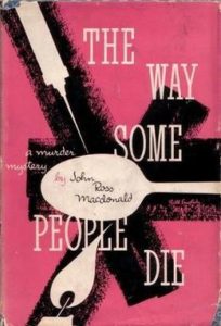
Even the format of chapter breaks sends signals to the reader. Some books use numbered words (“Twelve”) and others numerals (“12”). Some books start each chapter on a new page while others do not. (I’ve noticed Ross MacDonald’s Lew Archer books often fail to start chapters on new pages, contributing to the detective’s relentless pace. Alex Garland’s superb The Beach is also laid out like this, another novel with a unremitting narrator.)
Children books are notorious for chapter titles (“At the Old Sawmill”). Other books merely indicate chapters with—you guessed it—exaggerated white space at the top of the page. Even the numbering of chapters may play a significant role in the telling of a story. Chapters (and page numbers!) are numbered backwards in Chuck Palahniuk’s Survivor, while the chapter numbers in The Curious Incident of the Dog in the Night-Time form a sequence of prime numbers because the narrator finds them pleasing.
I’ve read enough books to know a chapter’s blank space (or lack of it) and the format of chapter titles plays a role, no matter how minor, in my reception of the book. If narration is a participatory act, and if you’re the kind of writer who believes every detail matters (and I think you should be that writer), then pay attention to how you employ blank space.
![]()
One temptation at this point is to suggest these white space markers are not so diverse after all—aren’t asterisks and line breaks and chapters merely for scene changes, separating the story’s structure in a less-blatant way than stage plays are marked (“Act IV Scene 2”)?
Not really. For example, a chapter may end on a cliffhanger and the next chapter pick up immediately where the last left off: same scene, same characters, same time and place. I’ve seen book chapters end with a line of dialogue and the next chapter open with another character’s reply. Writers often use chapter breaks to highlight the importance of that moment in the narrative, but they’re not a scene break per se.
This is what I mean when I say you, the writer, should pay close attention to your use of blank space. When you insert blank space in your next story—a scene ending with a second break, or starting a new chapter—ask yourself what your story gains (or, what your story loses) with the blank you’ve added.
It strikes me as fashionable these days for writers to break apart short stories into quick, MTV-like section breaks. Often each section builds a little emotion, heightens some tension, then drops off and shifts to a new scene. Try writing a short story told in one uncut narration. Try writing a short story told in one uncut scene. Try writing a short story in one paragraph.
Likewise, if you’re working on a novel. question each chapter break. Should these two sequential chapters be “glued” together? Or perhaps the first chapter should conclude earlier, or the second chapter start later?
I have a bad habit of starting a chapter in media res, that is, in the middle of the action, and a couple of paragraphs in, jump to a flashback explaining how the characters wound up in this action. Most times this indicates a poor choice of where I started the chapter. Some times I drop the flashback entirely and it’s not a problem at all. The flashback added little, and removing it only strengthened the chapter as a whole.
But the exercise itself is a questioning of blank space in my fiction. What purpose does this particular use of blank space serve? Does it add or subtract from the story?
For a real-world example of empty space in fiction, here’s a selection from Jim Thompson’s The Killer Inside Me. Look how Thompson uses fictive closure to avoid the censor’s red pencil in 1952:
I jerked the jersey up over her face and tied the end in a knot. I threw her down on the bed, yanked off her sleeping shorts and tied her feet together with them.
I took off my belt and raised it over my head. …
I don’t know how long it was before I stopped, before I came to my senses.
(Those ellipses are in the original.) Welcome to fiction’s version of “blood in the gutter”—a craven act of violence committed by three periods in sequence and the white space between the paragraphs.
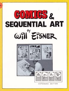 Before Eisner, books on comics focused on technical production: inks, scripting, musculature, shading, etc. (The most prominent example I know of is How to Draw Comics the Marvel Way, the standard go-to guide for aspiring fourteen year-olds back in the day.) Comics & Sequential Art focused on the language of comics, much as a book on film theory would discuss camera angles and shot selection as the “language” of movies.
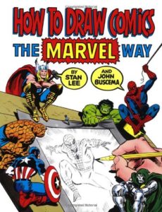
 McCloud dogfooded comics. His entire thesis, from first page to last, is told in comic form. He demonstrates the ubiquitousness and power of comics by drawing comics. The only places McCloud “reverts” to pure text are the Acknowledgments and Bibliography pages (where he can be forgiven, since I doubt anyone wants to read a Bibliography set to comic form).
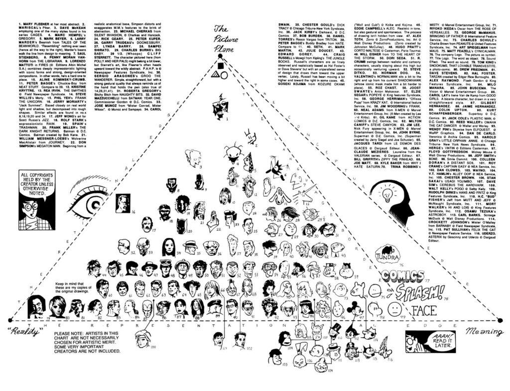